Franziskuswerk Schönbrunn
Diversity needs a shared pattern.
How a jointly clarified identity becomes a brand presence that connects professional diversity and makes people visible in their individuality.
Franziskuswerk Schönbrunn supports people with disabilities across different areas of life. A wide range of services, facilities and professional perspectives shape the organisation. They all share the goal of enabling participation and a self-determined life through their daily work.
In the grown external presence, this common ground was increasingly hard to see. Different design solutions and communication tools conveyed an inconsistent picture. The task was therefore: how can we make visible what connects Franziskuswerk at its core while preserving its diversity?
Understanding what connects
It began with a comprehensive reputation analysis. Qualitative and quantitative studies involved more than 600 people: employees, the people in its care, relatives, partners and other stakeholders.
The analysis combined internal and external perspectives. It showed which strengths are attributed to Franziskuswerk, what people value about the organisation and where more clarity is needed.
On this basis, together with managers and employees, we worked out the identity, the brand core and the shared values. The new presence thus gained a traceable foundation in the organisation’s self-image and lived work.
Professional diversity as a unifying idea
The guiding idea of “professional diversity” condensed a particular strength of Franziskuswerk: different competencies and perspectives work together to support people individually and enable participation.
It connects the social mission with professional standards. Human dignity, inclusion and participation become effective in everyday life through expertise. This connection was meant to be visible in the visual identity as well.
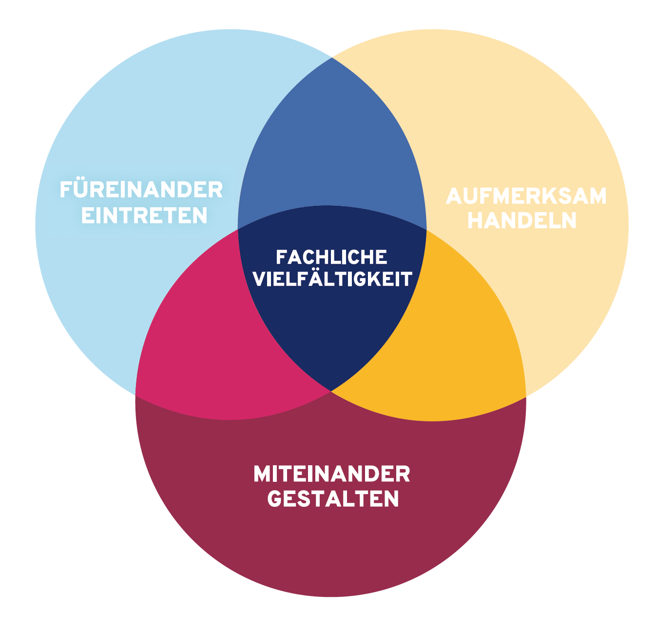
The clarified identity set the direction for the design. Logo, shapes and applications became parts of one shared system that conveys belonging across different facilities and media.
Many possibilities, one shared whole
A defining element of the visual identity we developed is the tangram. A few basic geometric shapes can be assembled into a wide variety of figures. Every shape contributes to the whole. New combinations open up new possibilities.
The new brand connects its Franciscan roots with a contemporary visual identity. Its basic shape is based on the Franciscan Tau and recalls Franziskuswerk’s history as an institution shaped by Franciscan sisters.
As a geometric puzzle with countless creative possibilities, the Tangram represents diversity in unity, a central idea at Franziskuswerk. Its seven pieces symbolise the seven core values and stand for the uniqueness of every individual. At the same time, the Tangram reflects Franziskuswerk’s professional diversity.
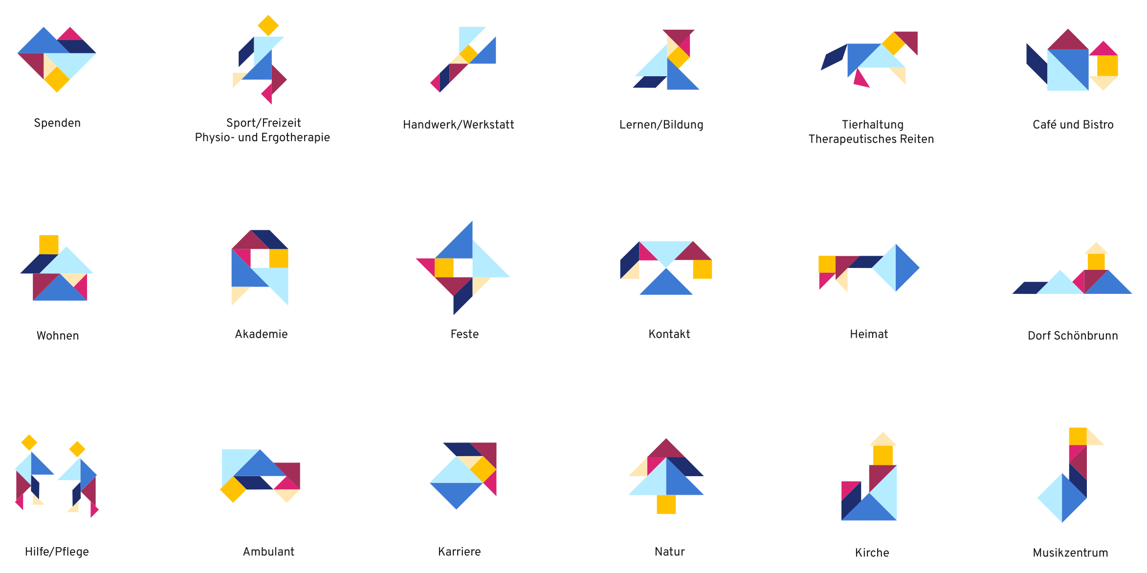
The tangram creates creative freedom within a recognisable system. It can be used in publications, wayfinding systems and digital applications. This lets the organisation’s diversity stay visible while being perceived as part of one shared brand.
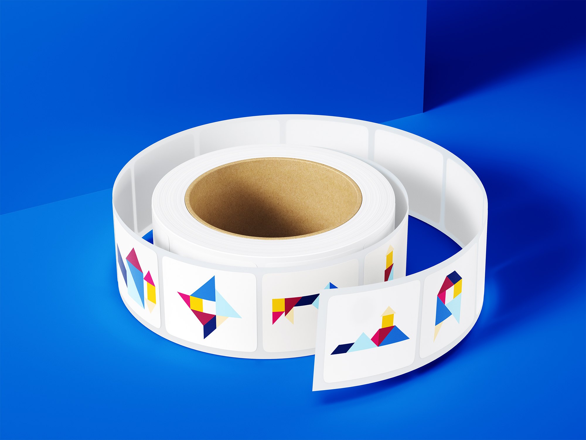
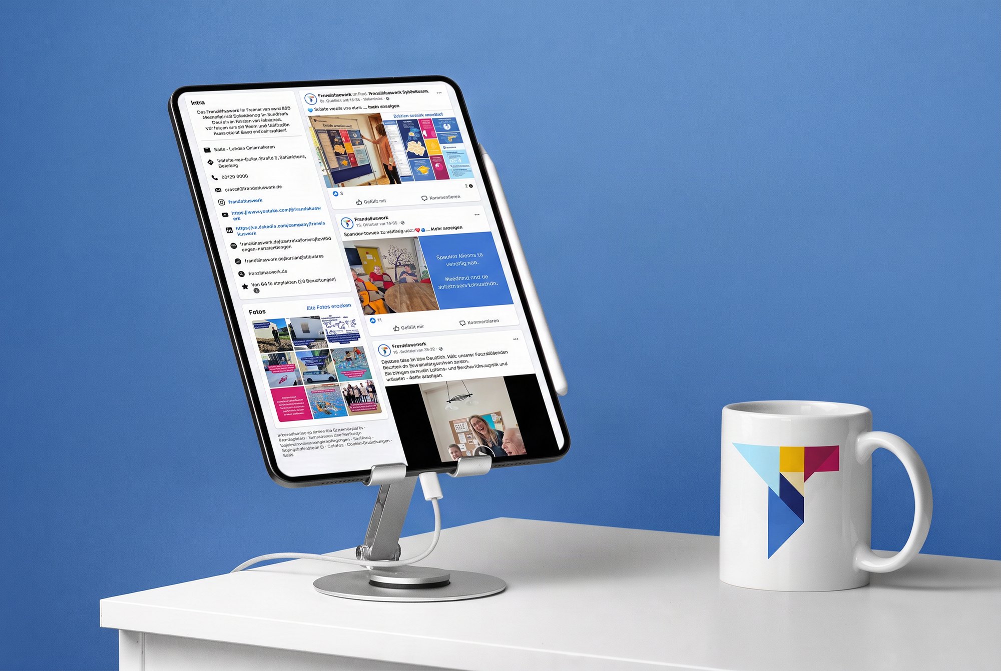
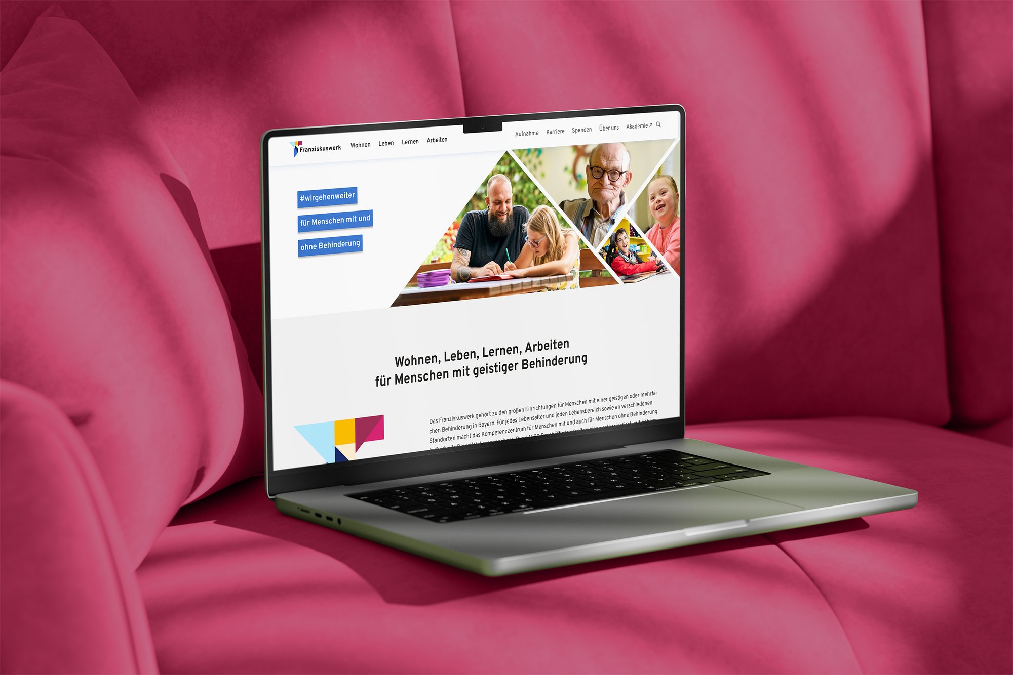
The new brand presence makes it clearer what connects Franziskuswerk. Communication gains clarity and recognisability while preserving the organisation’s human warmth.
For employees, their own contribution becomes visible in a shared picture. Externally, a coherent presence emerges that combines professional competence with respect for the individuality of every person.
A shared identity gives diversity cohesion.
The Franziskuswerk case shows how identity work and design interlock. A clarified self-image creates orientation. A flexible design system translates that orientation into everyday life and allows development within a shared pattern.
Design becomes the expression of an attitude: individual in the detail, connected as a whole.
Reputation analysis · Identity and values work · Brand core · Corporate design · Visual design system · Concept proposals for analogue and digital applications